Sunday, November 13, 2011
Saturday, October 15, 2011
Design Brief CUVCOR04B
I was given a design brief by Ashleigh to develop a logo and brand for a fictional camera shop/café called The Image Café. Before I go into further detail on the process of coming up with the logo, here is the final product:
.
The idea behind the proposed business is essentially a place where you can have photos developed, and have a relaxing cup of coffee while you wait for said photos to be developed. In addition, it would also offer cameras and accessories for photography.
The non-negotiable parts of the brief were that it needed purple, blue, black and grey. In addition, there needed to be the logo itself, a brochure, a point-of-sale promotional product, a poster or booklet, and a website mockup.
So, I was a little stumped on ideas, before deciding to put a camera shutter in a tea cup! I also considered making a camera lens a mug, however that didn't have as much of a desired effect. During the first consultation, Ashleigh was really impressed with the logo I had come up with, and seemed rather content with how the logo was coming along. I struggled a little bit to find an appropriate font, because I wanted something classy and something that yells out quality and finesse, and using Times New Roman or Garamond would have been far too obvious, so I decided to use Day Roman instead. I found that the particular font was still decent and suited my needs, without being a bleeding obvious mass-distributed font.
The second consultation went pretty well. I was a bit stumped on what exactly to do for the point-of-sale product, particularly because I didn't entirely understand the concept of it at the time, but then I came upon the idea of using a camera lens-shaped mug that would come in a variety of colours, essentially using the same colours that is used on the logo. I pitched the idea at Ashleigh, and she was particularly happy with the idea.
Once I had the colours sorted out, I went to the Pantone+ guide to suss out colours that would closely match those that I had settled on. The colours I settled upon were:
Here's the brochure that I had come up with. I didn't want to put in too much information to overwhelm the potential customer, so I kept it nice and simple, and straight to the point, with necessary prices and such.
Front
Back
And here is the website mockup:
I had quite a bit of fun doing this! And I really hope that Ashleigh also likes what I came up with. She hasn't seem the final product yet (since she wasn't here last week) but I'm sure it'll be exactly what she was after.
.
The idea behind the proposed business is essentially a place where you can have photos developed, and have a relaxing cup of coffee while you wait for said photos to be developed. In addition, it would also offer cameras and accessories for photography.
The non-negotiable parts of the brief were that it needed purple, blue, black and grey. In addition, there needed to be the logo itself, a brochure, a point-of-sale promotional product, a poster or booklet, and a website mockup.
So, I was a little stumped on ideas, before deciding to put a camera shutter in a tea cup! I also considered making a camera lens a mug, however that didn't have as much of a desired effect. During the first consultation, Ashleigh was really impressed with the logo I had come up with, and seemed rather content with how the logo was coming along. I struggled a little bit to find an appropriate font, because I wanted something classy and something that yells out quality and finesse, and using Times New Roman or Garamond would have been far too obvious, so I decided to use Day Roman instead. I found that the particular font was still decent and suited my needs, without being a bleeding obvious mass-distributed font.
The second consultation went pretty well. I was a bit stumped on what exactly to do for the point-of-sale product, particularly because I didn't entirely understand the concept of it at the time, but then I came upon the idea of using a camera lens-shaped mug that would come in a variety of colours, essentially using the same colours that is used on the logo. I pitched the idea at Ashleigh, and she was particularly happy with the idea.
Once I had the colours sorted out, I went to the Pantone+ guide to suss out colours that would closely match those that I had settled on. The colours I settled upon were:
- PANTONE 7662 CP (purple)
- PANTONE 2925 CP (light blue)
- PANTONE Cool Gray 5 CP
- PANTONE Process Black C
Here's the brochure that I had come up with. I didn't want to put in too much information to overwhelm the potential customer, so I kept it nice and simple, and straight to the point, with necessary prices and such.
Front
Back
And here is the website mockup:
I had quite a bit of fun doing this! And I really hope that Ashleigh also likes what I came up with. She hasn't seem the final product yet (since she wasn't here last week) but I'm sure it'll be exactly what she was after.
My design brief CUVCOR04B
One of our recent assessments had us tasked with coming up with our own design brief for a new business. Me, being the motorsport enthusiast I am, decided to go for a motorsport-oriented business, with its own private racing facility. I figured that just having a race track was a bit of a bore, so I also opted to include tours, events and the like.
Business name
Riverina Revsport
Contact details
Josh Horsley
E-mail: j.horsley@gmx.com
Mobile: 0417582775
Project Type and
Title
Branding and promotion of Riverina Revsport.
Background
Riverina Revsport is a new and exciting venture into the
world of Australian motorsport and the very colourful history of Australia's
automotive history. Our main focus will be providing a driving ring through the
rural countryside just outside of Wagga Wagga, inspired by public road courses
including Australia's own Mount Panorama, the autobahns of Germany, including
the legendary Nürburgring Nordschleife, and events such as Targa Florio, Rallye
Monte Carlo, and Isle of Man TT.
The circuit itself will be around 17km in length, situated
within the southern outskirts of Wagga Wagga. The circuit will run clockwise,
and will feature many fast sweeps combined with tricky, technical sections. The
main inspiration for the overall layout of the circuit will be to emulate the
feel of driving through the Australian countryside, however it will still be
very challenging for all levels of driving ability. We will also have a go-kart
circuit situated adjacent of pit lane, providing our own go-karts suitable for
all ages. In the future, we may also hold club-level competitions for the more
competitive drivers, providing a cheap and local alternative for those living
in the Riverina.
Our facilities will be capable of holding track days,
historic car festivals, and in the future, world-class events. We want to put
Wagga Wagga on the world map, and we believe strongly that, given the sporting
history of Wagga Wagga, and the Riverina in general, we can create a new and
exciting motorsport hub in Australia, and possibly the southern hemisphere. We
will be open to the public on most days, closing for a week every three months
for maintenance purposes.
While the main focus of Riverina Revsport will be the
circuit, we will also be offering tours for motoring enthusiasts for events
including a tour of Britain during the Goodwood Festival of Speed, and a tour
of Europe during the European summertime following several Formula One rounds,
the 24 Hours of Le Mans, and the 24 Hours of Nürburgring, whilst also giving an
opportunity to see the sights of Europe between race events. In addition, we
will be able to provide packages for specific motorsport events, including many
Formula One, MotoGP, V8 Supercars, and many sports car events. In addition, we
will be offering advanced driver training courses, along with defensive driving
courses, and the opportunity to acquire a CAMS racing license.
Main circuit pricing:
1 × one hour session - $50
2 × one hour sessions - $80
3 × one hour sessions - $110
Day pass - $150
1 month superpass - $1250 (50 one hour sessions)
Spectator entry - $25
Go-kart circuit pricing:
1 × one hour session - $35
2 × one hour session - $55
3 × one hour session - $75
Day pass - $100
Spectator entry - free
Memberships:
Club membership - $50
Club memberships are given upon the first visit, and is
required for using the facilities. In addition, club membership grants free
spectator entry to the main circuit, and some local businesses will also
provide discounts for their services (e.g. tyre shops, fuel stations,
mechanics, etc). It also grants free entry for track days and local festivals.
Super membership - $100
Super membership has the same benefits as a club membership,
along with a 10% discount to access of both the main and go-kart circuits, plus
free grandstand spectator seats.
VIP membership - $175
VIP memberships have the same benefits as a super
membership, however the discounts increase from 10% to 20%, and is the only
membership that allows members to utilise the trackside corporate facilities.
We will have a shopfront on Baylis Street in the Wagga Wagga
CBD for making bookings of tours and/or purchasing pre-paid passes for the
circuit, along with licensed merchandise and memorabilia from various
motorsport teams and manufacturers.
Client's competitors
None locally
Demographic
All ages and genders,
particularly oriented towards car enthusiasts.
What is the client
hoping to achieve through this project?
We hope to promote a new and exciting experience for all
people, and to potentially discover new motorsport talent.
Is there any existing
branding material?
No.
What are the
non-negotiable parts of the brief?
The logo must have black at the very least. If you wish to
use a mascot, then please make sure it is relevant to the region. Please make
sure that the logo's theme is relevant to motoring and motorsport.
The brochure must include a map of the overall circuit
(which will be up to the developer). It must include pit lane facilities,
spectator seating, go-kart circuit (which must be adjacent to the pit
facilities), track marshal boxes, medical/accident bays, and run-off/gravel
trap sections. In addition, please include the entry pricing for the circuit.
We will provide a basic layout of the circuit, including the proposed location
of the circuit.
Specification of art
and products required:
·
Logo (both black/white and colour)
·
Relevant slogan
·
Point of Sale 3D Promotional product - possibly
motorsport-themed
·
Website design
·
A4 gate folded double sided DL brochure
·
Mock-up of our storefront on Baylis Street
Production Timeline
and Deadline
First report and revision - Tuesday 30th August
Second report and revision - Tuesday 13th September
Final product - Tuesday 20th September
Budget Guideline
No budget
Prepared by
Josh Horsley
Date
15th August 2011
Tuesday, September 20, 2011
My initial job within the Kidson's Cycles Project was as a client liaison along with Ashleigh. During this time, we met up with Kris on multiple occasions for presenting logos and receiving feedback prior to the final presentation.
I was then in charge of developing the business letterhead for Kris, of which Kris appeared to be very pleased with the final product!
With my colour choices for my logo, I initially chose a deep green/orange colour combination, which essentially represented nature and adrenaline. I then decided to go with a light/dark green combination, following on with the emphasis of nature but also having a feeling of freedom and energy.
Monday, September 19, 2011
Business identities - Names
Accounting - Paula Jones Accounting
Hardware Shop - Bob's Hardware Shack
Graphic Design Studio - Ginger Ninja Creations
Requirements - business card, letterhead, with comp's slip
Hardware Shop - Bob's Hardware Shack
Graphic Design Studio - Ginger Ninja Creations
Requirements - business card, letterhead, with comp's slip
Monday, September 12, 2011
Sunday, September 11, 2011
Business stationary critique
Smith & Jones Lawyers:
- Play around with font weights
- Detail text could be a little smaller
- With Comp's background could be lighter
Mango Creative:
- Detail type was too big and loosely spaced
Sunday, August 21, 2011
Tuesday, August 9, 2011
yep

CALM - I see calm as light pastel colours, airy-fairy (hence the bubbles/clouds) and generally a relaxed atmosphere.

ANGER: Rage. Epic rage. Lots of red and black, blood, anger, rage, chaos. The shapes are essentially incoherent and very sharp, random, hazy and very messy. Colours are also very dark and evil.

EXCITEMENT: Failed a bit I think... Probably more suited to jumping for joy rather than showing actual excitement. I see vibrant greens and yellows as rather exciting, although I did use green to break up the yellow a bit so it didn't seem so much of an eye-killer. The "suns" are balls of energy, which is the result of atoms becoming excited and stuff. I think so anyways.
I don't really care whether the colours are "right", that's just how I feel, I honestly don't care what other people say. If I got the colours wrong, then I guess there's something wrong with me, isn't there?
REFERENCES:
http://www.infoplease.com/spot/colors1.html
http://library.thinkquest.org/27066/psychology/nlcolorpsych.html
http://www.precisionintermedia.com/color.html


Essentially we had to come up with an idea for a new logo for Snappy Jim's Mowing Service.
tl;dr version: top one is my excuse of an epic failure, took too long doing a shitty 3D effect and the final product wasn't even halfway finished for the black/white version. Bottom one was the winning version, and when you compare the two, you can definitely see why the bottom one won.
Tuesday, July 26, 2011
design ideas for my map of Australia
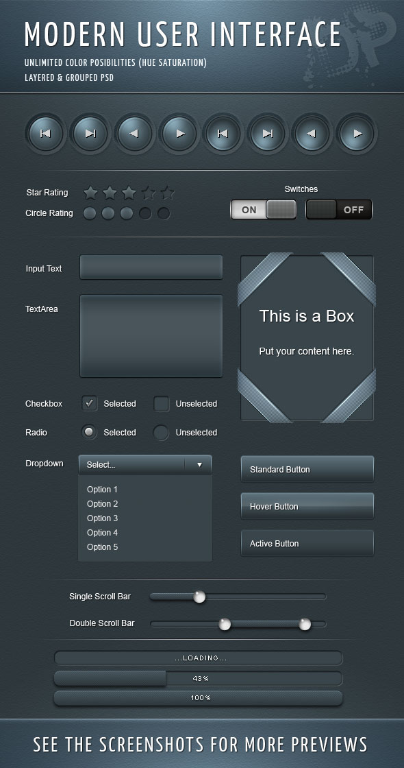
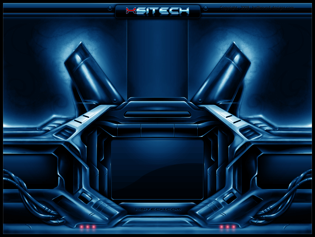
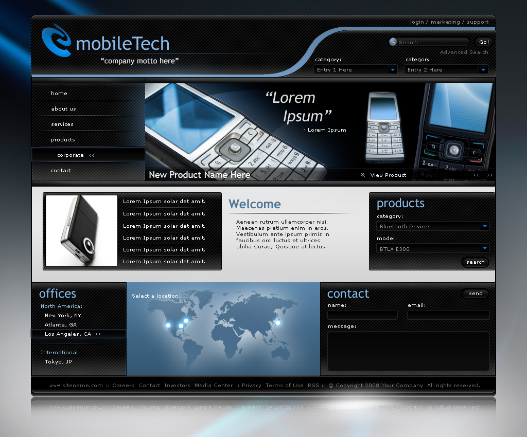
Essentially I'll be aiming for a more modern look of Australia, shiny and stylish, with a very crisp and clean feel to it. I'm thinking of also making the landmarks of Australia into clean, stylised graphics. The following examples should help with getting an idea of what I have in mind.
Overall interface:

Landmarks:

Overall interface:


Landmarks:
Subscribe to:
Comments (Atom)


