Josh Horsley's Graphical Meanderings
Thursday, August 2, 2012
Wednesday, May 2, 2012
Wednesday, February 22, 2012
Types of Photography #2
This post shall be covering Sports, Product, and Experimental/Abstract photography.
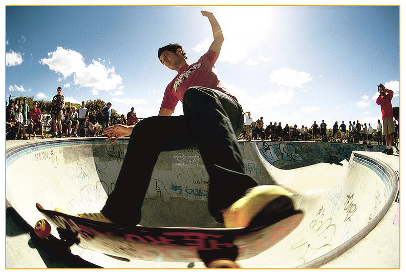
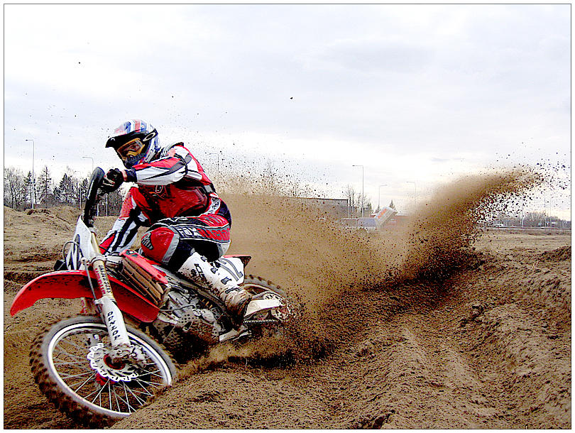
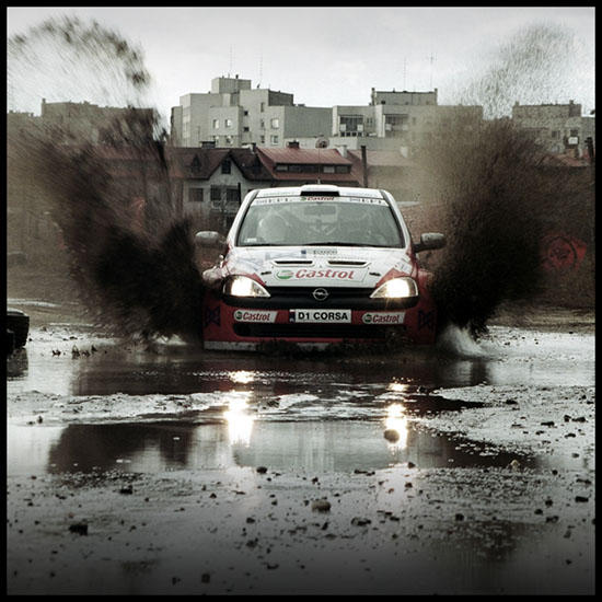
SPORTS
http://mountain-troll.deviantart.com/art/Old-skool-3-13843897
http://boozy79.deviantart.com/art/Motocross-17181628
http://wuerce.deviantart.com/art/watersplash-4667138
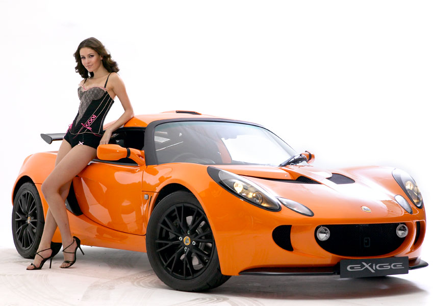
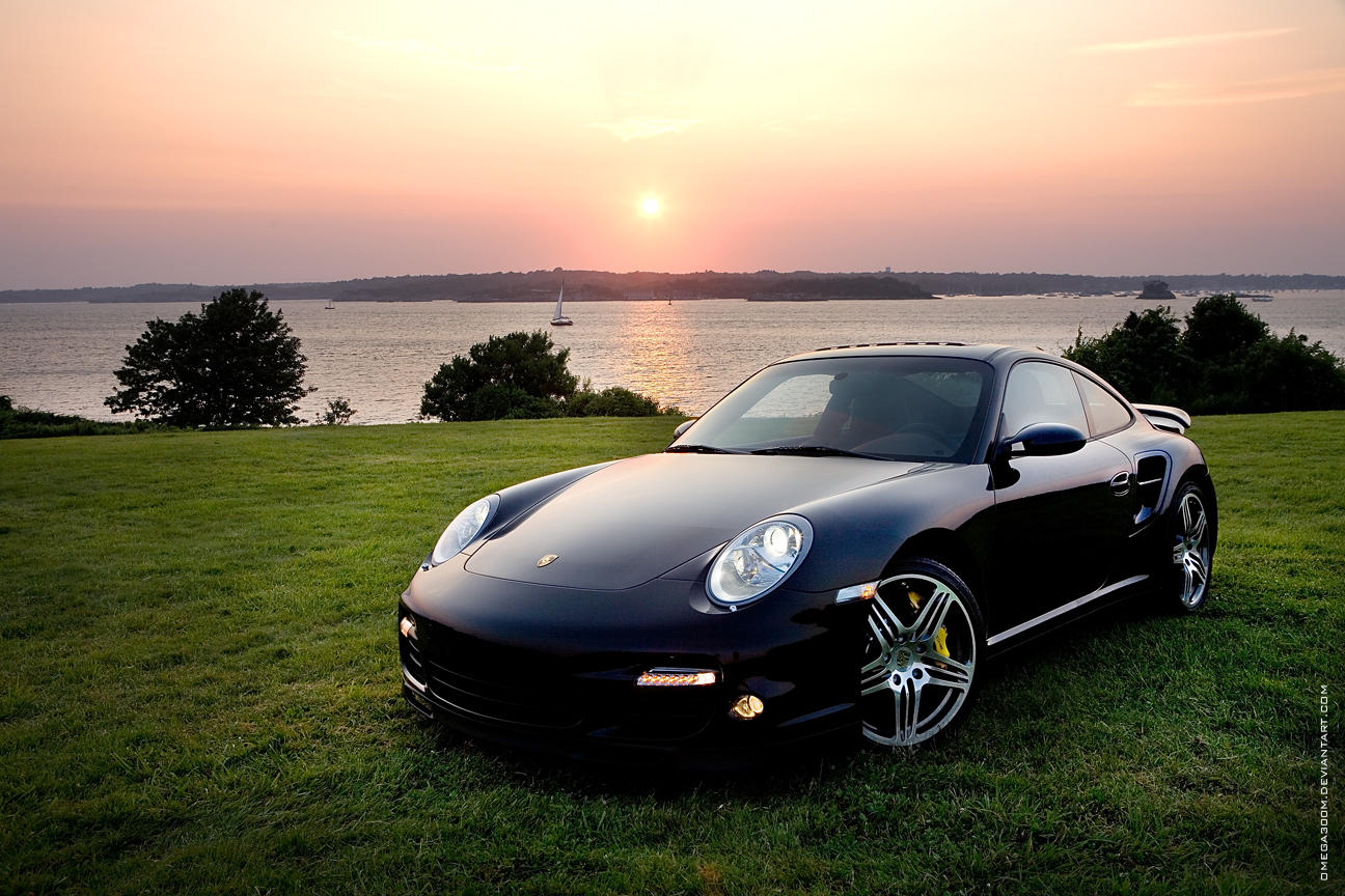
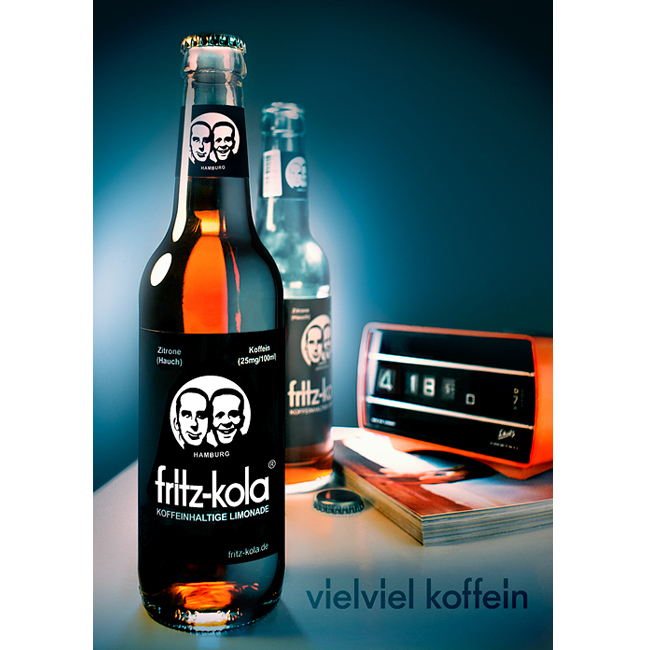
PRODUCT
http://sim4nee.deviantart.com/art/Lotus-44105404
http://omega300m.deviantart.com/art/997-Turbo-II-36186336
http://hipppy.deviantart.com/art/fritz-kola-packshot-91647150
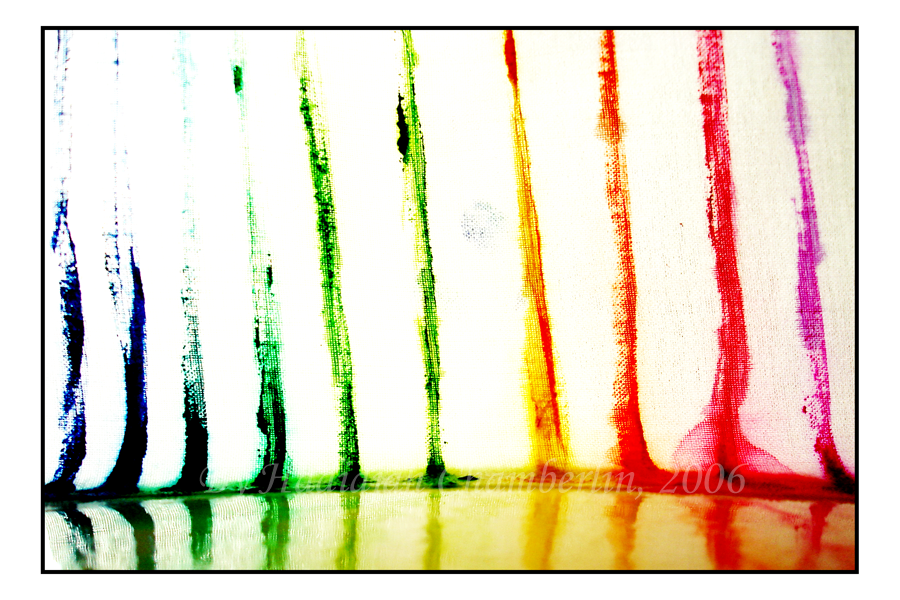
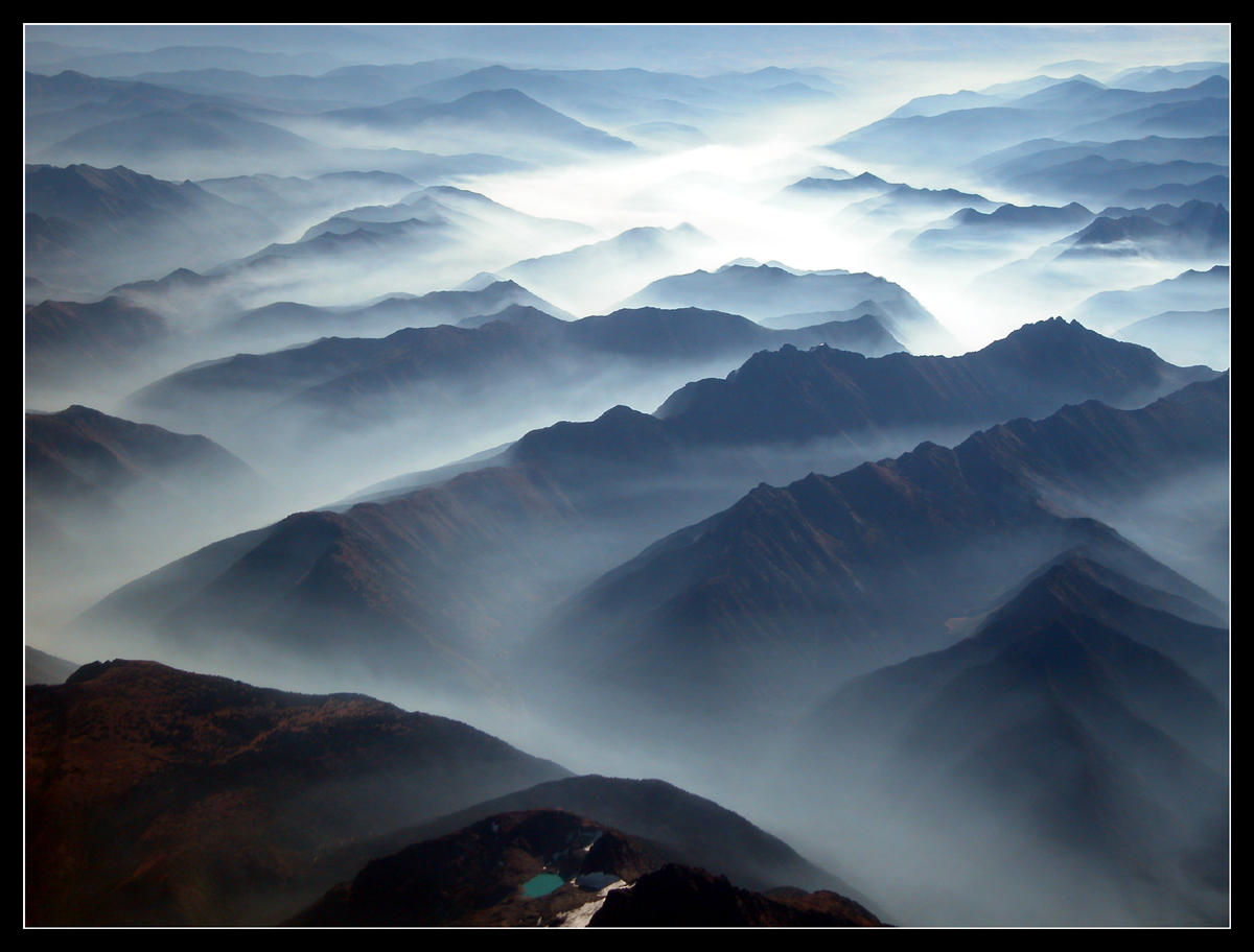
EXPERIMENTAL/ABSTRACT
http://vanerich.deviantart.com/art/the-city-lights-152148064
http://hadidjah.deviantart.com/art/Bands-32004069
http://dachux.deviantart.com/art/Latvia-29654861
Types of Photography #1
This post will be covering Landscape, Portrait, and Wedding photography.
LANDSCAPE
http://zeroskyy.deviantart.com/art/finding-middle-earth-3317027
http://scotto.deviantart.com/art/Waterfall-of-Life-1435425
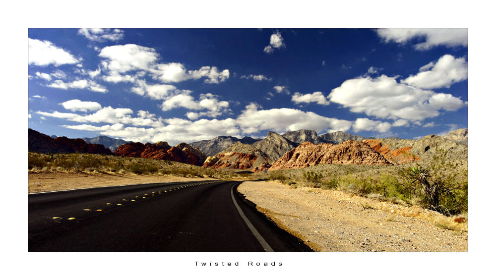
http://cravingfordesign.deviantart.com/art/C4D-Twisted-Roads-3785383
PORTRAIT
http://furtivelungs.deviantart.com/art/Prayer-70552375
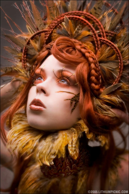
http://lithiumpicnic.deviantart.com/art/Natural-History-24867853
http://benoitpaille.deviantart.com/art/La-realite-est-lente-130489334
WEDDING
http://dumpvalve.deviantart.com/art/Wedding-90172220
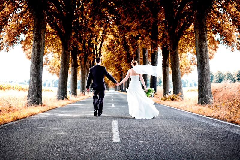
http://petrusloo.deviantart.com/art/the-wedding-107726675
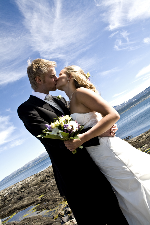
http://lukassowada.deviantart.com/art/With-you-207126752
LANDSCAPE
http://scotto.deviantart.com/art/Waterfall-of-Life-1435425
http://cravingfordesign.deviantart.com/art/C4D-Twisted-Roads-3785383
PORTRAIT
http://furtivelungs.deviantart.com/art/Prayer-70552375
http://lithiumpicnic.deviantart.com/art/Natural-History-24867853
http://benoitpaille.deviantart.com/art/La-realite-est-lente-130489334
WEDDING
http://petrusloo.deviantart.com/art/the-wedding-107726675
http://lukassowada.deviantart.com/art/With-you-207126752
Something about BHP
Also, resurrecting this blog for the new year. Most stuff on here is old and will probably be gone soon enough.
Sunday, November 13, 2011
Saturday, October 15, 2011
Design Brief CUVCOR04B
I was given a design brief by Ashleigh to develop a logo and brand for a fictional camera shop/café called The Image Café. Before I go into further detail on the process of coming up with the logo, here is the final product:
.
The idea behind the proposed business is essentially a place where you can have photos developed, and have a relaxing cup of coffee while you wait for said photos to be developed. In addition, it would also offer cameras and accessories for photography.
The non-negotiable parts of the brief were that it needed purple, blue, black and grey. In addition, there needed to be the logo itself, a brochure, a point-of-sale promotional product, a poster or booklet, and a website mockup.
So, I was a little stumped on ideas, before deciding to put a camera shutter in a tea cup! I also considered making a camera lens a mug, however that didn't have as much of a desired effect. During the first consultation, Ashleigh was really impressed with the logo I had come up with, and seemed rather content with how the logo was coming along. I struggled a little bit to find an appropriate font, because I wanted something classy and something that yells out quality and finesse, and using Times New Roman or Garamond would have been far too obvious, so I decided to use Day Roman instead. I found that the particular font was still decent and suited my needs, without being a bleeding obvious mass-distributed font.
The second consultation went pretty well. I was a bit stumped on what exactly to do for the point-of-sale product, particularly because I didn't entirely understand the concept of it at the time, but then I came upon the idea of using a camera lens-shaped mug that would come in a variety of colours, essentially using the same colours that is used on the logo. I pitched the idea at Ashleigh, and she was particularly happy with the idea.
Once I had the colours sorted out, I went to the Pantone+ guide to suss out colours that would closely match those that I had settled on. The colours I settled upon were:
Here's the brochure that I had come up with. I didn't want to put in too much information to overwhelm the potential customer, so I kept it nice and simple, and straight to the point, with necessary prices and such.
Front
Back
And here is the website mockup:
I had quite a bit of fun doing this! And I really hope that Ashleigh also likes what I came up with. She hasn't seem the final product yet (since she wasn't here last week) but I'm sure it'll be exactly what she was after.
.
The idea behind the proposed business is essentially a place where you can have photos developed, and have a relaxing cup of coffee while you wait for said photos to be developed. In addition, it would also offer cameras and accessories for photography.
The non-negotiable parts of the brief were that it needed purple, blue, black and grey. In addition, there needed to be the logo itself, a brochure, a point-of-sale promotional product, a poster or booklet, and a website mockup.
So, I was a little stumped on ideas, before deciding to put a camera shutter in a tea cup! I also considered making a camera lens a mug, however that didn't have as much of a desired effect. During the first consultation, Ashleigh was really impressed with the logo I had come up with, and seemed rather content with how the logo was coming along. I struggled a little bit to find an appropriate font, because I wanted something classy and something that yells out quality and finesse, and using Times New Roman or Garamond would have been far too obvious, so I decided to use Day Roman instead. I found that the particular font was still decent and suited my needs, without being a bleeding obvious mass-distributed font.
The second consultation went pretty well. I was a bit stumped on what exactly to do for the point-of-sale product, particularly because I didn't entirely understand the concept of it at the time, but then I came upon the idea of using a camera lens-shaped mug that would come in a variety of colours, essentially using the same colours that is used on the logo. I pitched the idea at Ashleigh, and she was particularly happy with the idea.
Once I had the colours sorted out, I went to the Pantone+ guide to suss out colours that would closely match those that I had settled on. The colours I settled upon were:
- PANTONE 7662 CP (purple)
- PANTONE 2925 CP (light blue)
- PANTONE Cool Gray 5 CP
- PANTONE Process Black C
Here's the brochure that I had come up with. I didn't want to put in too much information to overwhelm the potential customer, so I kept it nice and simple, and straight to the point, with necessary prices and such.
Front
Back
And here is the website mockup:
I had quite a bit of fun doing this! And I really hope that Ashleigh also likes what I came up with. She hasn't seem the final product yet (since she wasn't here last week) but I'm sure it'll be exactly what she was after.
Subscribe to:
Posts (Atom)


